Oftentimes, particularly individuals within small organizations, find themselves undertaking roles with which they may not be entirely familiar in order to accomplish tasks. This can involve crafting significant presentations, designing flyers, or even drafting invitations.
If you’ve struggled designing visually appealing materials, I’m here to help.
Graphic design encompasses the art and skill of crafting visual communication that is not only effective but also attractive and engaging. Its applications span various domains, including branding, marketing, advertising, education, entertainment, and beyond.
Whether you’re a nonprofit organization, a business owner, a student, or simply pursuing graphic design as a hobby, I’ve compiled some top graphic design tips to aid you in creating designs that are not just appealing but also effective and professional.
BRANDING
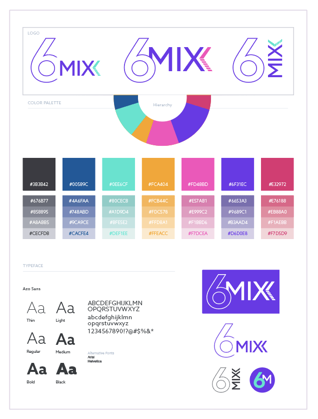
1. Use logos and branding to create identity and recognition.
Use consistent colors, fonts, and shapes that reflect your brand personality and values.
2. Choose a color scheme that matches your brand identity and the mood of your product or message.
Use a tool like Coolors to generate harmonious palettes.
3. Use typography to communicate your message effectively.
Choose fonts that are legible, appropriate, and consistent. Use no more than two or three fonts in your design.
STRUCTURE
4. Use white space to create breathing room and clarity.
Don’t overcrowd your design with too many elements or too much text.
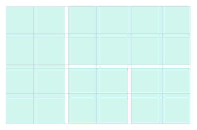
5. Use a grid system.
It will help align your elements and create a balanced layout.
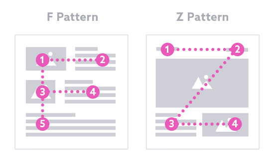
6. Consider conventional eye flow patterns.
Eye flow is the way that your eye moves or is led around a composition. A graphic design with good eye flow will lead the viewer’s eye throughout the layout, moving from element to element with ease. The most common eye flow patterns are the Z pattern and the F pattern.

7. Use focal points to create interest.
A focal point is an element that attracts the most attention in your design. Use elements such as color, shape, size, or position to create a focal point.
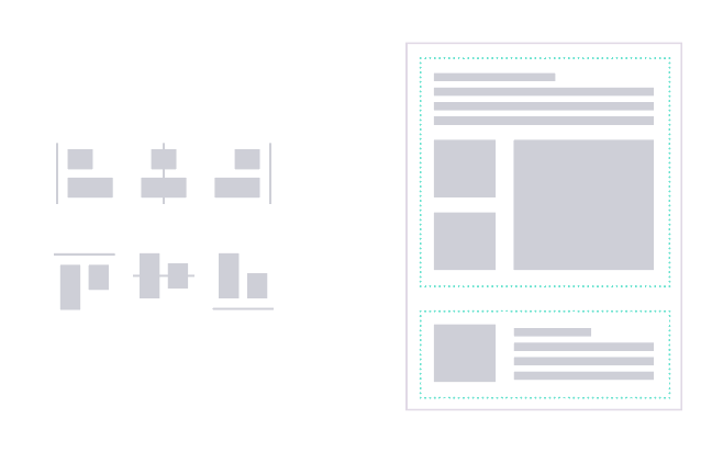
8. Use alignment and proximity to create organization and connection.
Align elements to create a neat and orderly layout. Use proximity to group related elements and separate unrelated ones. Use margins and padding (the space around an object) to create space and alignment.
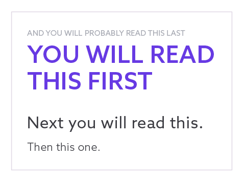
9. Use contrast to create hierarchy and focus.
Make the most important elements stand out by using different sizes, colors, fonts, or shapes.

10. Use scale and proportion to create emphasis and balance.
Scale elements up or down to create contrast and hierarchy. Use proportion to create a sense of order and harmony. Use the golden ratio or the rule of thirds to create aesthetically pleasing compositions.

11. Use repetition and consistency to create unity and harmony.
Usually, in graphic design using an element or style one time makes it look out of place (unless used for emphasis). Repeat elements such as colors, fonts, shapes, or icons to create a consistent and coherent design.
12. Use balance and symmetry to create stability and calmness.
Balance elements by distributing them evenly across your design. Use symmetry to create a mirror image of elements along an axis. Use asymmetry to create a dynamic and interesting design.
VISUALS
13. Use images that are relevant, high-quality, and original.
Avoid using clichéd or generic stock photos. If possible, use your own photos or illustrations.
14. Use icons and symbols to convey information quickly and visually.
Use a tool like Font Awesome to access a large library of icons for various purposes. Make sure you stay consistent with the style of icon throughout.

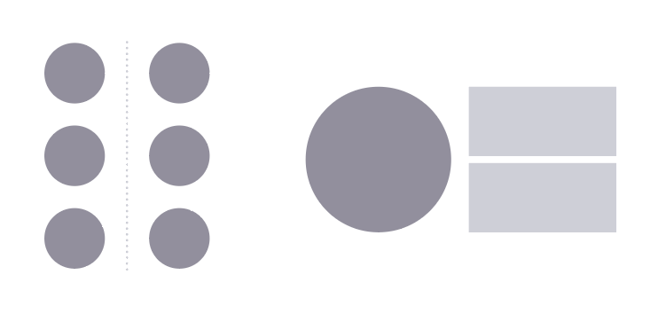
15. Use shapes and lines to create interest and structure.
Use circles, squares, triangles, or other geometric shapes to add variety and contrast to your design. Use lines to separate, connect, or emphasize elements. But remember, less is usually more, so don’t go overboard.
16. Use gradients and shadows to create depth and realism.
Use a tool like CSS Gradient to generate smooth and colorful gradients for your backgrounds or elements. Use shadows to create a sense of light and dimension.

17. Use patterns and textures to create richness and variety.
Use a tool like Subtle Patterns to access a collection of subtle and elegant patterns for your backgrounds or elements. Use textures to create a tactile and organic feel.

18. Use charts and graphs to display data and statistics.
Use a tool like Chart.js to create responsive and customizable charts and graphs for your data. Use colors, labels, and legends to make your charts and graphs easy to understand and compare.
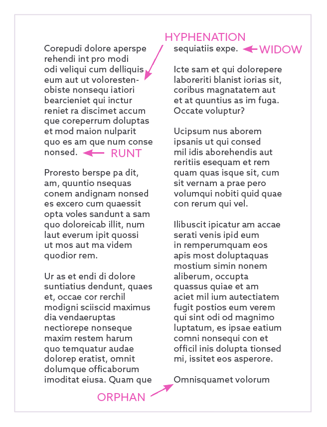
19. Clean up how your text is displayed.
Fix any words that got auto-hyphenated (breaking the word to start a new line), and any widows, runts, and orphans. Adjust any awkward letter or line spacings—too much can be just as hard to read as too little.
20. Use tools and resources to save time and effort.
Use a tool like Creative Market and Adobe Stock to access and purchase ready-made design assets such as fonts, icons, graphics, templates, and more. Use a tool like Unsplash to access and download free and high-quality photos for your design.